Introduction
In contemporary risk science, risk is seen from a broader perspective than just the likelihood and consequences of potential events. Aven 2013 introduces a new way of looking at risk that incorporates not just the probability and consequences, but also the strength of knowledge about these probabilities and consequences and the possibility of unforeseen or “black swan” events.

What is a risk plot?
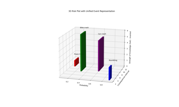
The graph features three critical measures that help assess risk associated with various events. These measures are:
- Probability: How likely is an event to occur?
- Consequences: What could be the potential impact or outcome of the event?
- Strength of Knowledge (SoK): How confident are we in the data we have about each event?
Why use a Risk Plot?
- Acknowledges Uncertainty and Knowledge Gaps: By considering the strength of knowledge, this approach acknowledges that our understanding of risks may not be complete.
- Prepares for Surprises: By accounting for potential surprises or black swan events, it helps organizations and individuals to be better prepared for unlikely but highly impactful events.
- Improves Decision-Making: By providing a more comprehensive view of risk, including knowledge gaps and potential surprises, decision-makers can make more informed choices about risk management.
The 3D aspect of the plot allows for a more comprehensive view of how these three critical factors interact. It helps stakeholders quickly perceive which areas require more attention or resources based on the combination of likelihood, impact, and certainty of the data. For example, an event that is highly probable, has severe consequences, and where we have weak knowledge (tall bar in the plot) suggests a high-risk area needing urgent focus.
Making a Risk Plot
I was surprised that I could not find any examples of how to make the risk plot described by Aven 2013. So I figured I would make my own. I started with what I thought would be the easiest option, putting some numbers in Excel and using the standard 3D charts. As you can see in the Excel file below it generates a useful, but not particularly good visualisation. The long bars make it impossible to represent the 90% confidence interval related to the consequences of the event as described in Terje Aven’s paper.
Using Python
I was more successful in making the graph using Python. I’m not any good at programming myself, but with the help of Chat-GPT, I got a very pleasing result. I used ‘mpl_toolkits.mplot3d’ to make the 3D graph. The code is at the end of this page.

Explanation of the Graph
So what exactly do we see in this graph? The four bars represent different risk events. From left to right a Plane Crash, Bike Crash, Car Crash and Stumbling. The height of the bar represents the (inverted) SoK. This means that a low SoK is shown as a high bar. This is done to draw more attention to events with little supportive knowledge. The length of the bar represents the consequences within a 90% reliability interval. So for stumbling, we know the consequences are likely minor. That is why the bar is short. For a Car Crash, on the other hand, the consequences can vary greatly.
Interactive Risk Plot
The interactive graph using Plotly
Code
The code below is the code I used for my first risk plot shown in the second image. Let me know if you found it useful!
import matplotlib.pyplot as plt
from mpl_toolkits.mplot3d import Axes3D
import numpy as np

# Define the data for the events
events = ["Stumbling", "Bike crash", "Plane Crash", "Car crash"]
colors = ['blue', 'green', 'red', 'purple']  # Colors for each event
sok = np.array([8, 4, 9, 5])  # Strength of Knowledge
consequences = np.array([2, 6, 9, 7])
probabilities = np.array([0.01, 0.3, 0.1, 0.8])  # Valid probabilities

# Initialize the 3D plot
fig = plt.figure()
ax = fig.add_subplot(111, projection='3d')

# Bar settings
ci = 1.645  # Z-score for 90% confidence interval (one-sided)
std_devs = np.array([0.5, 1.0, 0.8, 1.2])  # Example standard deviations for consequences

# Maximum SoK for normalization (inverting the scale)
max_sok = max(sok)
inverted_sok = max_sok - sok + 1  # Invert SoK values (plus 1 to avoid zero height)

# Creating bars for each event
for i, event in enumerate(events):
    x = probabilities[i]
    y_lower = consequences[i] - ci * std_devs[i]
    y_upper = consequences[i] + ci * std_devs[i]
    y_pos = (y_lower + y_upper) / 2
    y_size = y_upper - y_lower

    # Draw the SoK bar with inverted scale
    # Adjusted bar width to 0.02 to make them thinner and avoid overlap
    ax.bar3d(x, y_pos, 0, 0.02, y_size, inverted_sok[i], color=colors[i], alpha=0.8)

    # Label for the event
    ax.text(x, y_pos, inverted_sok[i] + 1, event, color='black')

# Set labels and title
ax.set_xlabel('Probability')
ax.set_ylabel('Consequences Interval')
ax.set_zlabel('Strength of Knowledge (SoK) - Inverted')

plt.title('3D Risk Plot with Unified Event Representation')
plt.show()


Leave a Reply