Safety Bubble Diagram
In contemporary risk science, risk is seen from a broader perspective than just the likelihood and consequences of potential events. Aven 2013 introduces a new way of looking at risk that incorporates not just the probability and consequences, but also the uncertainties related to these consequences and probabilities.
Different ways of visualising the uncertainties can be used. One example is a risk plot, which I have discussed in this post. The risk plot can be good in an interactive dashboard but is less suited in a paper report. In that case, the bubble diagram is a better alternative.

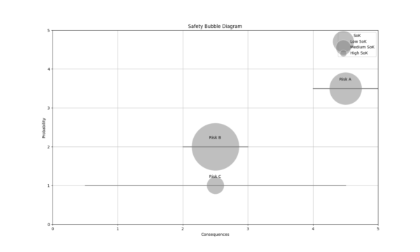
In this diagram, the severity of the consequences is shown on the x-axis, typically reflecting a 90% confidence level or prediction interval for the consequences. This means that the assessor is 90% certain that the real consequences of the event will fall within the specified range. The y-axis represents the probability of the event occurring, where the likelihood is expressed as the assessor’s degree of belief, based on the background knowledge available.
In addition to the 90% confidence interval for the consequences, bubble diagrams incorporate uncertainty into the visualization by adjusting the size of the bubbles. The bubble size reflects the Strength of Knowledge (SoK), which shows the reliability of the information used to estimate the probability and consequences. A larger bubble indicates a lower strength of knowledge, meaning more uncertainty surrounds the risk estimates. Conversely, a smaller bubble suggests that the assessor has strong supporting data or consensus among experts, leading to higher confidence in the probability and consequence predictions.
Python code
Use the following code to make the bubble diagram from the picture yourself.
import matplotlib.pyplot as plt

# Example data for events
events = ["Risk A", "Risk B", "Risk C"]
consequences = [4.5, 2.5, 2.5]
probabilities = [3.5, 2.0, 1.0]
bubble_sizes = [7000, 15000, 2000]

# Create the bubble plot
fig, ax = plt.subplots()

for i, event in enumerate(events):
    x, y = consequences[i], probabilities[i]
    x_lower, x_upper = (0.5, 4.5) if event == "Risk C" else (x - 0.5, min(x + 0.5, 5))

    # Plot bubbles and lines (all in gray)
    ax.scatter(x, y, s=bubble_sizes[i], color='gray', alpha=0.5, edgecolors='w')
    ax.plot([x_lower, x_upper], [y, y], color='gray', linewidth=2)
    ax.text(x, y + 0.2, event, fontsize=10, ha='center')

# Customize the plot
ax.set(xlabel='Consequences', ylabel='Probability', xlim=[0, 5], ylim=[0, 5])
ax.set_xticks(range(6))
ax.set_yticks(range(6))
ax.grid(True)
plt.title('Safety Bubble Diagram')

# Add legend (all in gray)
handles = [
    plt.scatter([], [], s=3000, color='gray', alpha=0.5, edgecolors='w', label='Low SoK'),
    plt.scatter([], [], s=1500, color='gray', alpha=0.5, edgecolors='w', label='Medium SoK'),
    plt.scatter([], [], s=300, color='gray', alpha=0.5, edgecolors='w', label='High SoK')
]
ax.legend(handles=handles, title='SoK', loc='upper right')

plt.show()


Leave a Reply