
When I moved to Norway three-ish years ago, I quickly learned that understanding geography here means more than just looking at the distance between two points. Because of fjords, mountains, ferries, and tunnels, the shortest distance between two points is rarely a straight line. It makes sense that Norwegians measure the ‘distance’ between two places in time rather than kilometres, which is the default in the Netherlands.
I recently found out that there is a ton of open-source geographical information out there. Whether you’re buying a house, planning a hiking trip, or working with spatial data professionally, knowing about these resources can save you time, money, and potentially even keep you safe.
Geonorge: Norway’s Open Geographic Data
Geonorge is Norway’s national portal for geographic information, operated by Kartverket (the Norwegian Mapping Authority). Think of it as a big library with a lot of free spatial data covering everything from property boundaries to natural hazard zones. There is also some data you would need to access through a distributor or, for example, be a member of Norge Digitalt.
The platform provides access to datasets from multiple Norwegian government agencies:
- Kartverket (mapping and property data)
- NVE (Norwegian Water Resources and Energy Directorate) – flood and landslide data
- DSB (Directorate for Civil Protection) – emergency preparedness data
- Individual municipalities and counties

What’s really good about this database is that, across these different departments, you can add overlays to 1 map. This means that combining overlays is quick and easy.
However, it can be a bit hard to find which map contains the data you need, and not all maps support this ‘combine’ functionality.
Safety Data: What You Should Check
As a risk analyst, I was, of course, interested in the safety data. Here is a quick overview of the relevant safety data. These maps are definitely worth checking if you are, for instance, considering buying a house in an area you might not be thoroughly familiar with.
Quick Clay Landslide Risk (Kvikkleireskred)
Quick clay—or kvikkleire—is a type of clay found throughout Norway that can suddenly liquify when disturbed, causing catastrophic landslides. The Gjerdrum disaster in 2020, where 11 people died, and entire houses disappeared into the ground, brought this risk into sharp focus.
Geonorge provides maps showing quick clay awareness zones (kvikkleireskred aktsomhetsområder). These aren’t precise predictions, but they indicate areas where quick clay may be present and where caution is warranted.
How to find it: Search for “kvikkleire” in Geonorge’s map catalogue and overlay it on your area of interest.
Flood Risk Areas (Flomfare)
NVE has mapped flood susceptibility across Norway, showing areas at risk from river flooding, flash floods, and storm surges. Given Norway’s dramatic topography and increasing rainfall intensity due to climate change, this data is becoming increasingly relevant.
Landslide and Avalanche Zones (Skredfare)
Norway has detailed mapping of:
- Rock avalanche zones (steinsprang)
- Snow avalanche zones (snøskred)
- Debris flow areas (jord- og flomskred)
This is particularly important if you’re looking at property in mountainous areas or near steep terrain.
Beyond Safety: Travel Time Maps
Now, let’s shift from hazards to something more practical for daily life: understanding how long it actually takes to get places in Norway.
In the Netherlands, where I’m originally from, we often talk about distances in kilometres. A place 50km away usually takes a predictable amount of time to reach. But in Norway? That 50km could take 45 minutes on a motorway, or three hours if it involves a ferry and a mountain pass.
This is where TravelTime becomes invaluable. It’s a free tool that shows you not distance, but actual travel time from any point.
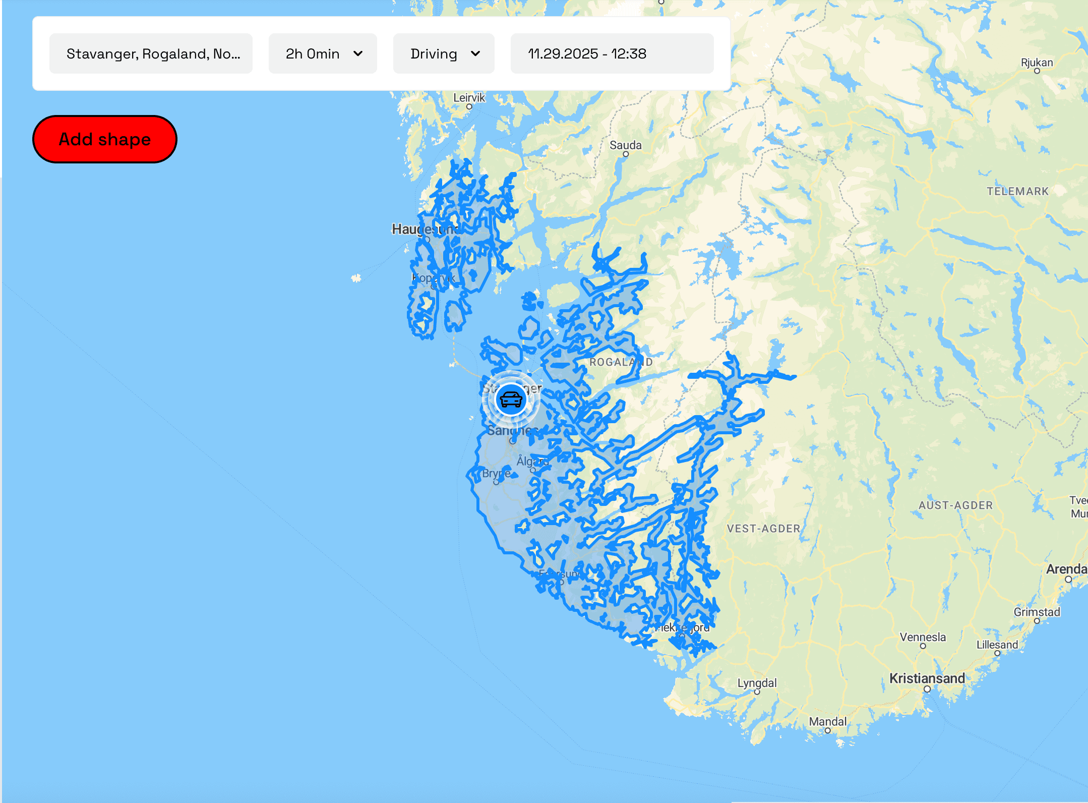
Use Case 1: Finding Where to Live
It’s a great tool for finding where you could live within a specific commute time. The example below shows some very intresting insights. You can see, for instance, that if you work at Akershus Festning, you could live above Jessheim and still reach work within an hour. In this case, because of the good connection between the city centre and Gardemoen Airport.
After testing it a bit, it is not 100% accurate compared to Google Maps. Jessheim station, for example, should also appear in the overlay. But it still provides an excellent starting point from which to delve deeper into the specifics.

What’s immediately apparent is how geography shapes the reachable area. Fjords create rigid boundaries. Ferry schedules matter. Tunnels and train stations open up unexpected possibilities.
Use Case 2: Planning Cabin Trips
I’m an avid hiker, and Norway’s DNT (Norwegian Tourist Association) cabin network is fantastic. But which cabins can I actually reach for a weekend trip from Stavanger?
Using TravelTime I can see which cabins are within a 2-3 hour radius. This is especially useful in the Stavanger area, where the Boknafjord tunnels and ferry connections create travel patterns that would be impossible to judge from a simple map.

Getting Started
Useful Links:
Conclusion
Norway’s commitment to open geographical data is excellent. Whether you’re a professional working with spatial analysis, a homebuyer doing due diligence, or simply someone trying to understand how long it actually takes to reach that mountain cabin, these tools are invaluable.
The combination of Geonorge’s comprehensive safety and infrastructure data with tools like TravelTime gives you a much clearer picture of Norwegian geography than any traditional map ever could.
And the best part? Most of it is accessible for free.
Have you used Geonorge or travel time mapping for anything interesting? I’d love to hear about it in the comments.
Leave a Reply