



Risk Analysis Tools

Risk Matrix Generator
Build a risk matrix that communicates risk without oversimplifying

SoK Assessment Tool
Explain uncertainty by visualising the Strength of Knowledge behind your risk assessment

Monte Carlo Simulator
Run a simulation to see how likely certain outcomes are
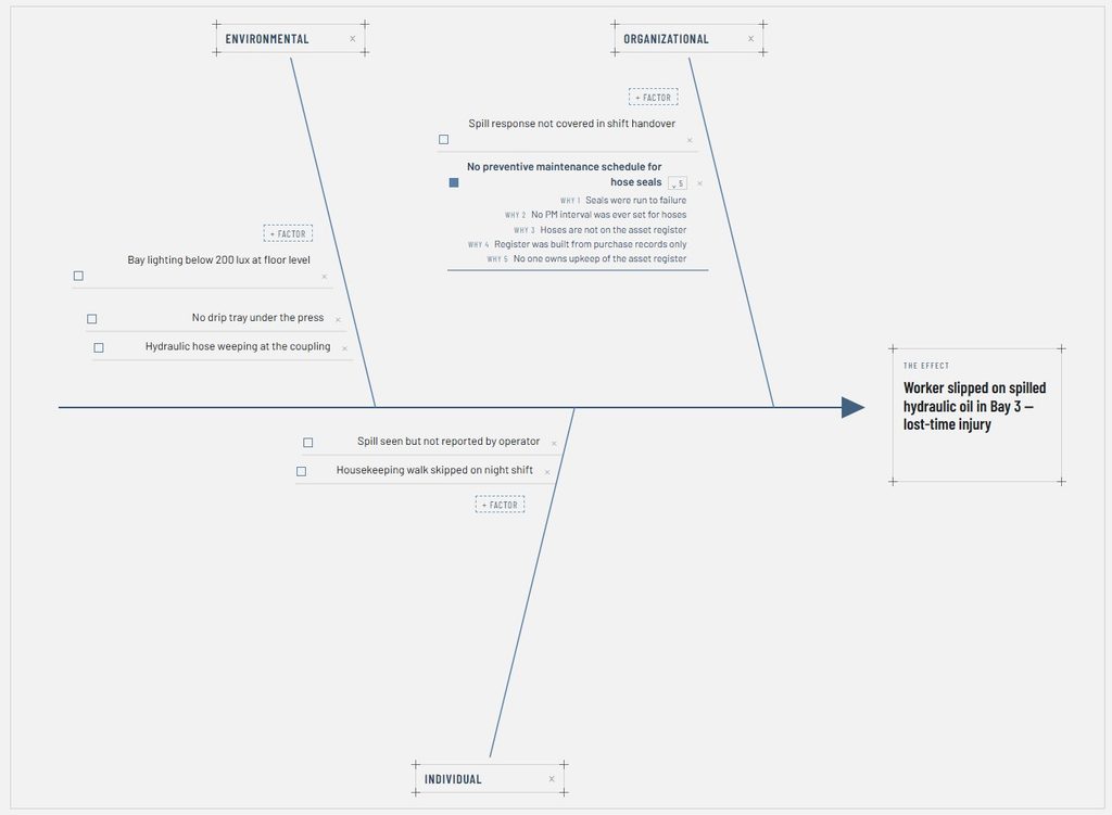
Ishikawa-diagram creator
Map causes among different categories to investigate an Incident
Blog
-
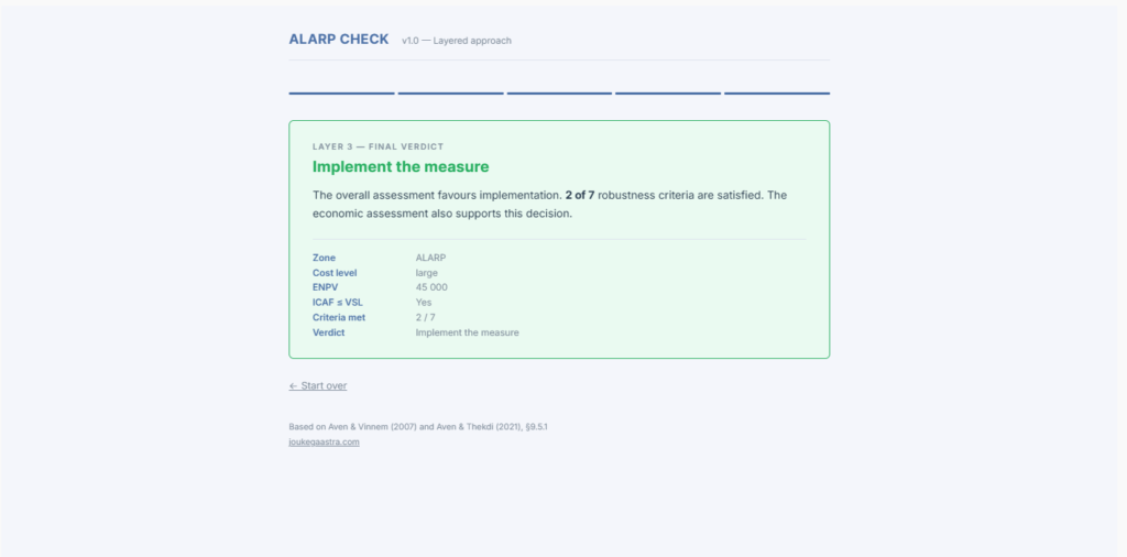
ALARP is often used in HSE management. But how to actually implement it? This post covers what ALARP means, where it comes from, and how to work through it systematically. What Does ALARP Mean? ALARP stands for As Low As…
-

Rethinking Risk Matrices: A Scoping Review of Probability Consequence Diagrams and Decision Framework for Diagram Selection
Two years ago, when I first started learning the academic side of risk analysis at the University of Stavanger, I discovered the gaps between academics and risk management in practice. Most of these gaps can be traced back to the…
-

My Life in Weeks
This is a map of my life — where each tiny box represents a single week I’ve lived or will (hopefully) live. All the boxes together represent 100 Years. I first came across this idea through Gina Trapani’s blog, who…
-

How to Create a Risk Matrix for Cyber Security using Python
Creating this cybersecurity risk matrix visualisation is more straightforward than it might initially appear. I’ve provided the complete Python code for generating this matrix, which uses matplotlib and numpy libraries. Install the required libraries (pip install matplotlib numpy) and run…
-

OpenRisk – A Free Online Tool for Creating Bowtie Diagrams
Since last summer, I’ve been working with Presight on a new software tool called OpenRisk. It’s basically a web-based platform for creating bowtie diagrams, and after months of testing and improvements, we have launched. So now is the perfect time…
-

900 Days of Duolingo Norwegian: Was It Worth It?
As I celebrate my 900-day streak learning Norwegian on Duolingo, it seems like the perfect time to reflect on whether this daily habit has actually improved my language skills. After living in Norway for two years and using Norwegian regularly…
Subscribe
Receive each new blog post in your Email. Once a week, easy to sign up, easy to cancel.