Introduction
Risk can be visualised in different ways, each offering unique strengths depending on the decision-making context. Below are 8 risk visualisations and insights on when to use them.
1. Risk Matrix

A risk matrix is one of the most common risk visualisation tools, plotting risks in a two-dimensional grid of probability vs. impact. Risks are categorised as low, medium, or high, depending on where they fall within the matrix.
Best Use:
- When there is strong supporting knowledge/data
- Basic risk assessment with minimal uncertainties
- Non-technical audiences
Limitations:
- A risk matrix often relies on the product of probability and consequence (expected value) to plot risks. However, two very different risks—one high-probability, low-impact and the other low-probability, high-impact—might be rated the same. Although they are very different in nature.
- Uncertainty Is Poorly Represented. No information is given on the knowledge used for the assessment. How sure can we be of the chosen probabilities and consequences, and what are the things we don’t know?
2. Bubble Diagram

A bubble diagram extends the traditional risk matrix by adding a third element: uncertainty. In this method, risks are represented as bubbles, where:
The bubble size represents the strength of knowledge (SoK)
The x-axis is the probability
The y-axis is the consequence described by a confidence interval
Best Use:
- Presenting multiple risks with varying degrees of uncertainty.
Limitations:
- More difficult to make and understand than a traditional risk matrix.
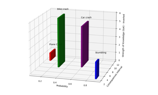
3. Risk Plot

A risk plot uses three axes to represent:
Strength of Knowledge (visualized as height in the third dimension)
Probability
Consequences (with 90% uncertainty intervals)
Best Use:
Effective when uncertainties play a critical role in decision-making
Limitations:
- More complex, requiring an understanding of risk science
4. Risk Radar or Spider chart/diagram

A risk radar (also called a risk spider chart) is used to visualise multiple dimensions on a circular chart with axes radiating outwards. They are often used for vulnerability assessments. But it can also be used to describe risks by using the dimensions of consequence, probability, strength of knowledge, etc.
Sfetsos, Thanasis & Leventakis, George & Moustakidis, Nikolaos & Gkrizis, Vasileios & Nikitakos, Nikitas. (2011). The development of a strategic risk analysis framework for interconnected surface transportation systems. IJCIS. 7. 177-199. 10.1504/IJCIS.2011.042975.
Best Use:
- Vulnerability assessment
- Multi-attribute analysis
Limitations:
- Limited in showing complex interrelationships between risks
- Can be difficult to interpret if many risks and dimensions are plotted
5. Multi-Attribute Risk Analysis (MARA)

Multi-Attribute Risk Analysis is a technique that considers multiple criteria for assessing risks. It assigns weights to different risk factors (such as financial, health, environmental, etc.) and scores them accordingly. It then aggregates these factors to provide an overall risk score.
Best Use:
- When comparing risk with multiple consequence dimensions.
Limitations:
- It can be hard to determine and compare different scales
6. Bow-Tie Diagram

Bow-Tie diagram is a visual representation of risk that shows both the potential causes and consequences of an event in a single diagram. The event is placed at the centre of the “knot,” with causes on one side (leading up to the event) and consequences on the other side (leading from the event).
Best Use:
- Identifying and visualising preventative and mitigative measures for a specific risk event in a single visualisation.
- Safety-critical industries such as aviation, oil and gas, and healthcare.
Limitations:
- Focuses on individual risks rather than a portfolio of risks
7. Bayesian Network or Directed Acyclic Graph

Bayesian Networks use a directed acyclic graph (DAG) to show how one event or risk factor influences others. Nodes represent risks, events, or variables, and the connecting arrows indicate causal relationships. Probabilities can be assigned to these connections, allowing for updates as new information becomes available.
Best Use:
Complex interdependencies: Useful when risks are interconnected and influence each other.
Dynamic updates: Ideal when you need to refine your risk model as more data becomes available.
Limitations:
Quantitative Bayesian networks rely on high-quality input data for meaningful results and can be difficult to interpret.
Relationships are one-directional and can not loop back.
8. Risk Radar

The risk radar can be used similarly to the Spider chart. In this instance, opportunities and risks are plotted in a time dimension. But (multiple) other dimensions can be used as well.
Best Use:
- Long-term risks: Effective for visualizing risks that evolve over time, especially for strategic or operational planning.
- Multiple dimensions: Multiple types of variables can be plotted.
Limitations:
- Complex interpretation: It can be hard to interpret if too many axes or risks are included.
- Lack of interrelationships: It doesn’t display how different risks might influence one another.
Conclusion
Choosing the right risk visualisation depends on specific needs, the type of risks you’re assessing, and your audience. Simple tools like risk matrices and heat maps work well for quick, high-level assessments, while more advanced methods like bubble diagrams and risk plots are better suited for complex risk analyses that require an in-depth understanding of uncertainty and multiple dimensions of risk.


Leave a Reply